Taj Mahal quartzite has been one of the most requested countertop materials in recent years — and for good reason. It’s soft-looking, durable, and flexible enough to work across different kitchen styles. The challenge usually isn’t the stone itself, but deciding what cabinet color actually works with it.
Taj Mahal works with more cabinet colors than most people expect, but choosing the right one can still feel tricky.
Once you understand the stone’s undertones, it becomes much easier to pair it with white, wood, or darker cabinetry.
The stone looks stunning and is extremely durable. This is the result of the geological properties of quartzite.
Key Takeaways
- Knowing the Hidden Colors: Taj Mahal is a warm stone. It has a creamy, off-white base. It also has veins of taupe, greige, and gold. Knowing these colors helps you make a perfect match.
- Choosing Warm Whites: When using white cabinets, avoid stark, cool whites. Instead, try soft, warm off-whites. For instance, you can go for Benjamin Moore White Dove or Sherwin-Williams Alabaster.
- Natural Wood Works Well: Wood cabinetry pairs naturally with Taj Mahal’s veining.
- Use Contrast for Depth: Charcoal gray, deep green, and navy blue dark cabinets succeed in composing drama. They give the kitchen a stylish look at the same time. The warmth of Taj Mahal keeps it from being too cold.
- Match the Overall Style: Your cabinet color should go well with the style of your house. It may be modern, traditional, or transitional.
Understanding the Beauty: A Taj Mahal Color Guide
The easiest way to choose cabinets is to start from the stone itself. Look closely at a Taj Mahal slab and you’ll notice a mix of soft, layered tones. Once you see those undertones, pairing becomes much easier.
The Warm, Creamy Base: More Than Just White
Taj Mahal isn’t pure white. Most slabs lean warm, with a creamy base that ranges from soft off-white to light beige. This warmth makes the stone inviting and flexible. It sets the mood for the whole kitchen.
Taj Mahal isn’t pure white. Most slabs lean warm, with a creamy base that ranges from soft off-white to light beige.
Reading the Veining: Taupe, Greige, Gold, and Grey Swirls
Soft, feathery veins flow through the creamy base. These are the accent colors you can use in your design.
- Taupe and Greige: Most slabs have gentle waves of taupe (brownish-gray) and greige (grayish-beige).
- Gold: You’ll find subtle streaks of warm gold. Some slabs have more gold tones. This adds a touch of luxury.
- Grey: You may also see soft, light grey swirls. These are usually warm greys, not cool ones.
Every slab is different. Some have more golden tones. Others have stronger grey or taupe veining. Always look at your specific slab in person. Do this before picking your final cabinet color.
How Light Changes Everything
Natural daylight tends to bring out the creamy tones, while cooler LED lighting can make the slab look a bit flatter.
Warmer bulbs around 2700K–3000K tend to bring out the richness, whereas cooler lighting makes the slab appear more muted.
Classic Style: Pairing Taj Mahal with White Cabinets
White cabinets are still the most popular choice — and for good reason.
They keep the space bright while letting the countertop stand out.
The key is choosing a warm white, since cooler tones tend to clash with Taj Mahal’s natural warmth.
Picking the Right White: A Color Guide
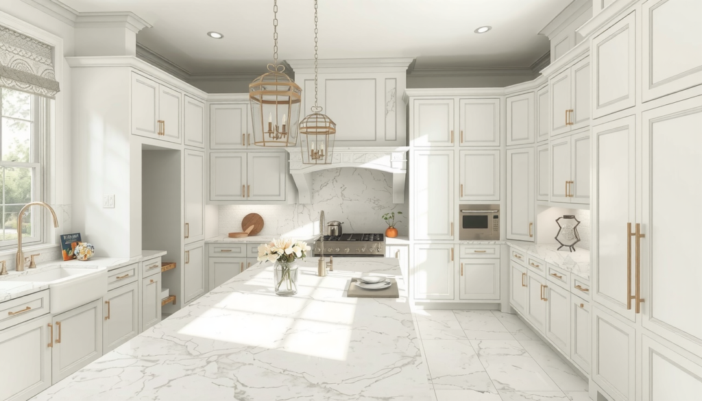
The biggest mistake is choosing a white that is too stark or cool. A cool, crisp white will clash with Taj Mahal’s warm colors. You need a warm, soft off-white instead. It should work well with the stone’s creamy base.
Here are safe white paint colors for your cabinets:
- Benjamin Moore White Dove: A loved soft white with a hint of warmth. It matches perfectly and never fails.
- Sherwin-Williams Alabaster: A slightly creamier off-white. It picks up the warm, beige tones in the countertop beautifully.
- Farrow & Ball Wimborne White: A classic, chalky off-white. It creates a sophisticated and timeless feel. It’s not too bright.
Hardware Finishes for a Polished Look
Hardware is like jewelry for your kitchen. For this classic pairing, the right finish completes the look.
- Warmth: Champagne bronze or unlacquered brass hardware brings out the golden veins in the stone.
- Timeless: Polished nickel offers a classic, elegant look. It’s warmer than chrome.
- Modern Contrast: Matte black hardware creates a striking contrast against white cabinets. It adds a modern touch.
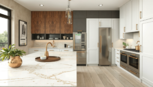
Natural Warmth: Pairing Taj Mahal with Wood-Tone Cabinets
Wood cabinetry pairs naturally with Taj Mahal. The grain adds texture that echoes the movement in the stone, making the overall look feel layered but still calm.
When paired well, wood cabinetry and Taj Mahal create a kitchen that feels warm, natural, and easy to live with.
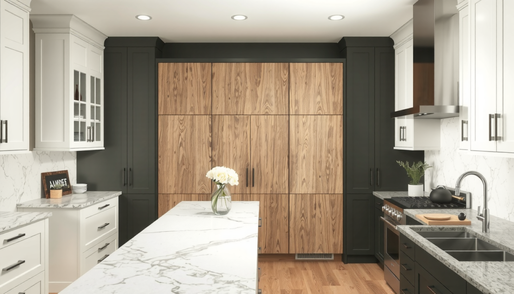
We recently completed a kitchen with white oak cabinets and Taj Mahal countertops, and the space turned out beautifully. The atmosphere was both modern and warm. It proves that wooden cabinets can be fresh and contemporary.
We recently completed a kitchen with white oak cabinets and Taj Mahal countertops, and the space turned out beautifully.
Light Woods for a Scandi or Coastal Feel
Light wood cabinets for Scandi or coastal designs tend to be breezy and open. They are the best choice for modern, Scandinavian, or coastal designs.
- White Oak: Being the first choice in 2026, it has a light color and a fine grain pattern that fits perfectly to Taj Mahal.
- Rift Sawn Oak: This oak cut has a straight grain pattern. It can be modern and clean while also showing natural warmth.
Medium and Dark Woods for Richness and Depth
Deeper wood tones create a richer, more grounded look. This mix can feel traditional, mid-century modern, or luxuriously moody. The contrast between dark wood and creamy countertop makes both stand out.
- Walnut: A popular choice for its deep color and beautiful grain. Walnut creates a sophisticated, high-end feel.
- Cherry and Alder: These woods have warm, reddish colors. They can match the golden colors in the stone.
Pairing rich wood like walnut with the durability and unique beauty of quartzite creates something special. You get a kitchen that is both a showpiece and works great for daily life.
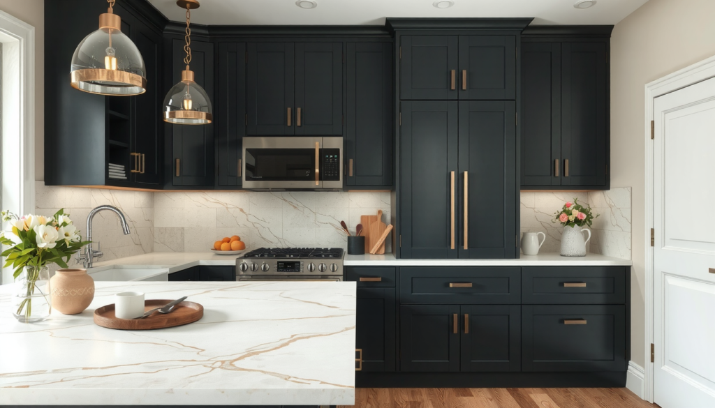
Bold Contrast: Pairing Taj Mahal with Dark Cabinets
Dark cabinets create strong contrast, while Taj Mahal’s warm undertones prevent the space from feeling too heavy or cold.
A Dark Cabinet Color Guide
Black isn’t the only option. Deep, moody colors can add personality without overwhelming the space.
- Charcoal Gray and “Greige”: A deep charcoal or warm, dark greige is softer than black. These colors connect to the gray and taupe veins in the countertop. One good example is Benjamin Moore Kendall Charcoal.
- Deep Green: This is a huge trend in 2026 and yet it feels classic. A dark earthy green like Sherwin-Williams Pewter Green creates a luxurious and organic vibe.
- Navy Blue: It is truly a classic and elegant choice. Navy displays a beautiful contrast with the creamy countertop and brass hardware.
Pro Tip: Balancing the Look
When using dark cabinets, balance is equally important. You want contrast, not a cave-like kitchen. Good under cabinet lights will brighten your workspace. You might want to think about adding upper cabinets made of glass fronts. This can break up the color. A brighter backsplash which is in a light color, is a good trick to keep the environment light.
Modern vs. Traditional: How Style Affects Your Choice
Your cabinet color choice should be a supporter of your dear home’s overall design style. Luckily, Taj Mahal would do well in nearly any pace. Below is a list of our suggestions for you.
Design Style | Best Cabinet Color Family | Recommended Cabinet Door | Go-To Hardware Finish |
Modern | White or Dark | Slab or Slim Shaker | Matte Black, Polished Chrome |
Traditional | White or Medium Wood | Raised Panel or Inset | Polished Nickel, Aged Brass |
Transitional | All options work well | Classic Shaker | Champagne Bronze, Satin Nickel |
Farmhouse/Coastal | White or Light Wood | Shaker or Beaded Inset | Matte Black, Satin Nickel |
Designer’s Toolkit: Ideas about Cabinet Design and Hardware
Achieving the ultimate look involves more than just color. The type of your cabinet doors is important. The hardware finish also matters. Other details make all the difference. This is the last step to a professionally designed kitchen.
The Impact of Cabinet Door Styles
Door styles are likely the most powerful tool on the kitchen’s overall look.
- Slab Door: A flat solid door without any panels or details. It gives a clean, simple, and modern look.
- Shaker Door: The simple flat center panel with a four-piece frame makes it versatile. It works with various styles such as transitional, farmhouse, and even modern styles.
- Raised Panel or Inset Door: These doors are more detailed and more classical. An inset door is put inside the cabinet frame, therefore it can more nicely be the craftsmanship which is shown off.
A Complete Hardware Color Guide
Make sure your hardware matches with both the cabinets and countertop.
- For a warm welcoming look: Champagne Bronze, Aged Brass. The metals used will highlight the golden veins in the stone.
- For a timeless classy look: Polished Nickel, Satin Nickel. Classic picks that are warmer than chrome.
- For a bold modern look: Matte Black. A finish that creates a statement with its contrast and that works especially well with white or light wood.
Putting It All Together: Backsplash and Flooring Ideas
For a seamless look, many designers prefer simple off-white ceramic tile with white cabinets. With wood cabinetry, marble mosaics or subtle veined tiles help tie the palette together. For wood cabinets, a simple marble mosaic can help to tie in the countertop’s veining. As for the flooring, light or medium-toned hardwood floors can go with any cabinet color nicely.
FAQ: Your Taj Mahal Quartzite Questions Answered
Is Taj Mahal quartzite warm or cool-toned?
Taj Mahal is mainly a warm-toned stone. Its creamy beige base and golden veining give it a warm character. Some slabs may have subtle cool grey accents.
What backsplash goes best with Taj Mahal and the white cabinets?
For a transition that outlasts time, just use a simple glazed ceramic tile in a matching off-white. For a touch of texture, a warm marble mosaic could be more interesting. A classic Calacatta Gold subway tile can also be used to complement the veining.
Can I use gray cabinets with Taj Mahal quartzite?
Yes, but be careful which gray you choose. A warm gray or “greige” with a touch of beige or brown colors will beautifully match with the Taj Mahal. Avoid cool, blue-toned grays as they will clash with the warmth from the countertop.
What is the best paint color for walls with Taj Mahal countertops?
A soft warm off-white that goes with the stone’s colors is a safe choice (e.g., Benjamin Moore Swiss Coffee). Another option could be a light greige taken from the veining for a slightly cozier feel.
How do I care for Taj Mahal quartzite countertops?
Taj Mahal is a natural quartzite, making it very durable. Clean it using a pH-neutral cleaner and a soft cloth. It’s less porous than marble but should still be regularly sealed (typically every 1-2 years) to protect against stains. Always quickly wipe away spills like wine or oil.